
Identifying Art at a Glance: How Can You Tell if Art is Original
Getting your work appraised may seem like a complicated process, but it is often much easier than you think to determine your appraisal needs. This article will help you identify mediums, artist signatures, gallery labels, and any other critical information that could answer your questions and determine whether or not you need a USPAP compliant appraiser to step in.
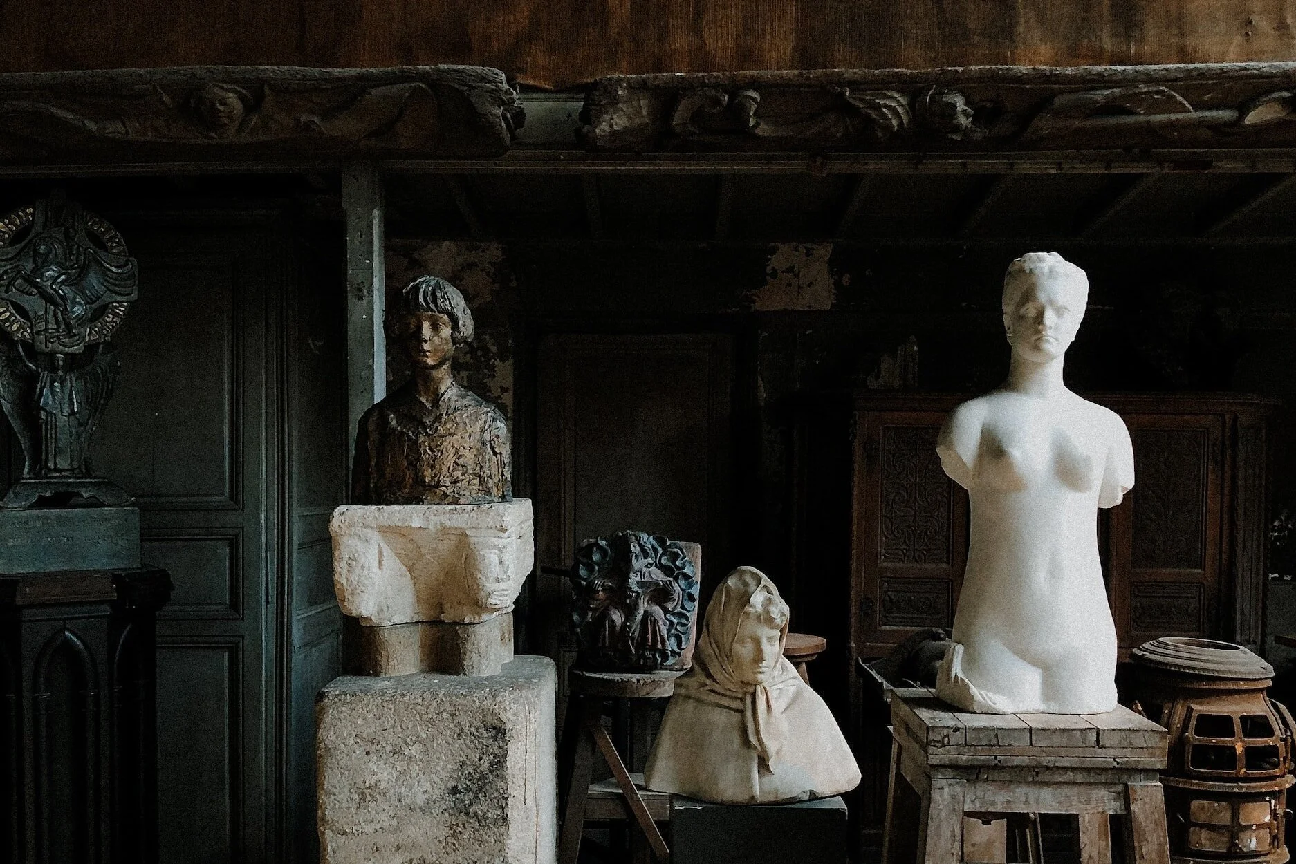
Most commonly, art appraisers are asked about a variety of two-dimensional artworks. Objects like furniture, sculpture, coins, memorabilia, and more can also be appraised depending on the appraisers’ specialty, but for fine art appraisers, values for paintings, drawings, and prints are among the most frequently requested. For the average person, paintings, drawings, and prints can be tricky to identify, but we are happy to offer some tips to help you determine if your painting or drawing is original or if your artwork is a print or reproduction.
To break it down, we have outlined the types of paintings, drawings, and prints that you may come across in your own collection, your grandma’s attic, the local thrift store, and more. This list is by no means exhaustive and as always, there are exceptions to the rule, so consider the following information a broad overview of the wide array of artistic media.
Drawings
Charcoal - A charcoal drawing will be done in black and white- sometimes grey- tones. Charcoal marks can be densely drawn in harsh blacks, or lightly pulled across the paper creating a wispy effect. Charcoal is often smudged due to its crumbly texture, making its marks harder to control and making its finish look matte and dry.
Graphite - Similar to charcoal, but graphite creates thinner and more precise markings. You may see evidence of blending here as well, with techniques like cross-hatching and stippling (crisscross lines or a series of thin lines to create depth) often visible. Unlike charcoal, graphite has a slight silvery shine, so angling it toward light might help determine what you are looking at.
Pastel/oil pastel - Pastels are known for their rich colors and texture. If you have a piece that can easily be smudged and has a tendency to accumulate dust on the floor below it or in the frame, it may be from the pastel itself. Regular pastels are like the colorful cousin of graphite, flaking and crumbling in the same way both on paper and in the hand. Oil pastels are much like what the name suggests- pastels made with an oily base, which often gives the medium a waxy appearance. Oil pastels appear less chalky and are rather smooth, shiny, and even creamy on paper. Work in oil pastel may appear more blended than the dryer pastel.
Ink - Ink is akin to graphite in the sense that marks made are more precise and controllable, but ink does not always show texture. Where graphite marks can be almost fuzzy with jagged edges, up close, ink creates a much smoother, seamless line. Ink comes in a variety of colors like black, gray, reds, and browns, and it may be possible to see the dilution of the ink changing in certain areas of the work. If the marks seem lighter in some areas, the ink likely became less and less concentrated as the artist worked.
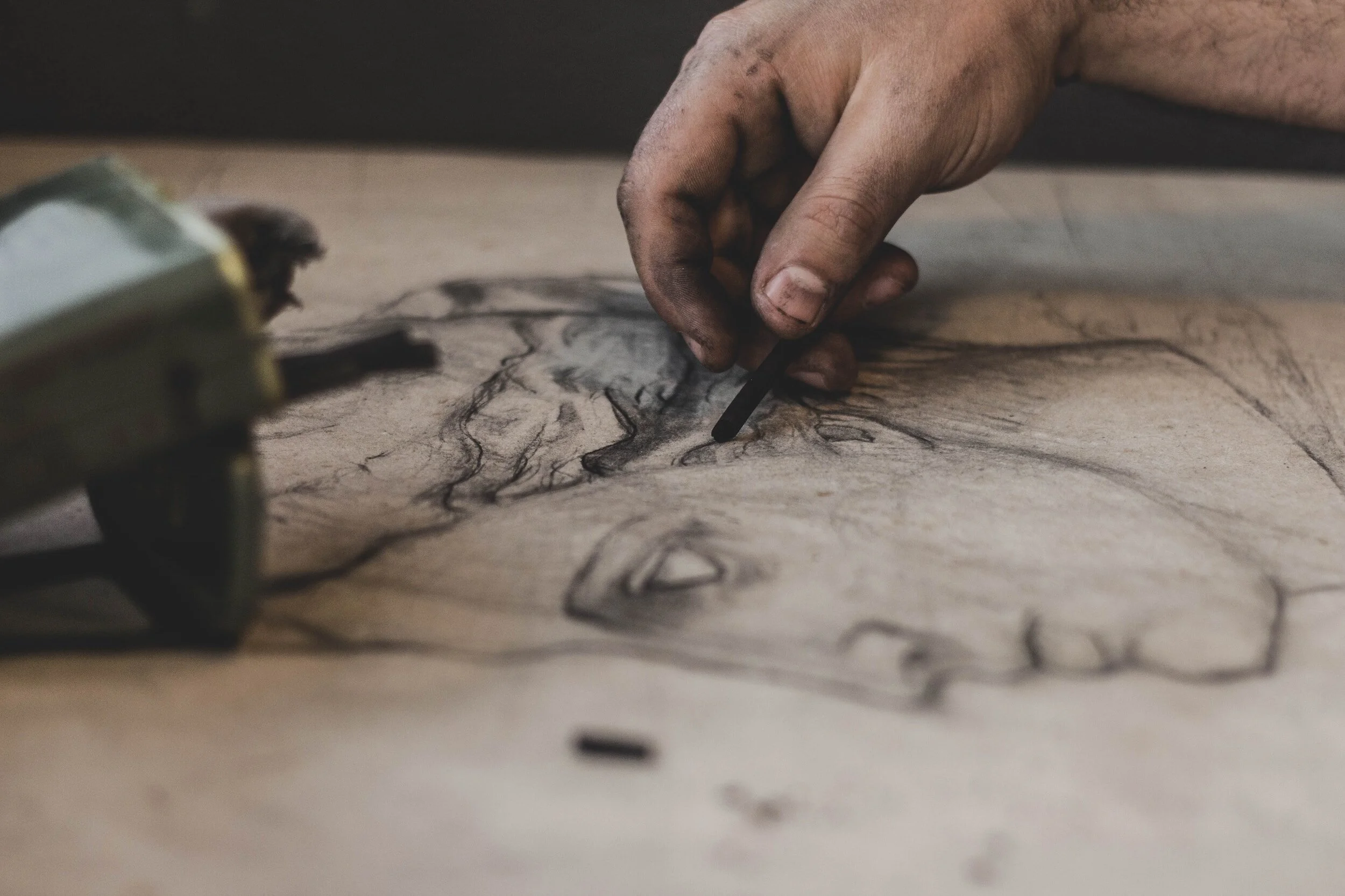
An example of a charcoal drawing.
Painting
Oil painting - If the work you are examining has been done on canvas, it is likely either acrylic or oil paint. Oil painting is glossier than acrylic, and builds texture in a way that acrylic usually cannot, often with identifiable brush strokes. The edges on the shapes in an oil painting are easily blended, which typically creates the soft edges and naturalistic quality we typically associate with oil. Oil paints are rich in color, but may become murky or yellow over time, due to a darkening varnish layer. If you spot web-like cracks in the paint, this is called craquelure and is an indication you are viewing an aging oil painting.
Acrylic painting - Acrylic creates bright and vivid colors on canvas as well, but the finished effect can be more matte than oil paint. Acrylic is thinner and composed of water rather than oil, making it generally less buildable and quite sheer in application. This makes the medium tricky to identify, as it can also be applied in washes, where a painter will water down the saturated acrylic to a thinner, watercolor-like texture. In acrylic works, the details and edges in the work are crisp, and the paint is generally flat (lacking the texture we see in oil paint).
Watercolor - Watercolor might be the easiest paint to identify, with its transparent, watery paint layers that appear perfectly flat. Watercolor itself cannot build texture, only opacity. There will be hardly any evidence of brush strokes or pigment on the surface of the work, but it is highly likely the work will be done on watercolor paper, which has a rather rough, bumpy and thick texture to better absorb the paint. Watercolor paint creates an effect that looks similar to a coffee stain, being lighter in the middle and darker around the edges.
Gouache - Gouache is technically a type of watercolor paint, but deserves its own classification because it behaves rather differently. Gouache reacts with water the same way, but is opaque rather than transparent. Gouache looks more matte, and is typically more blendable than watercolor.
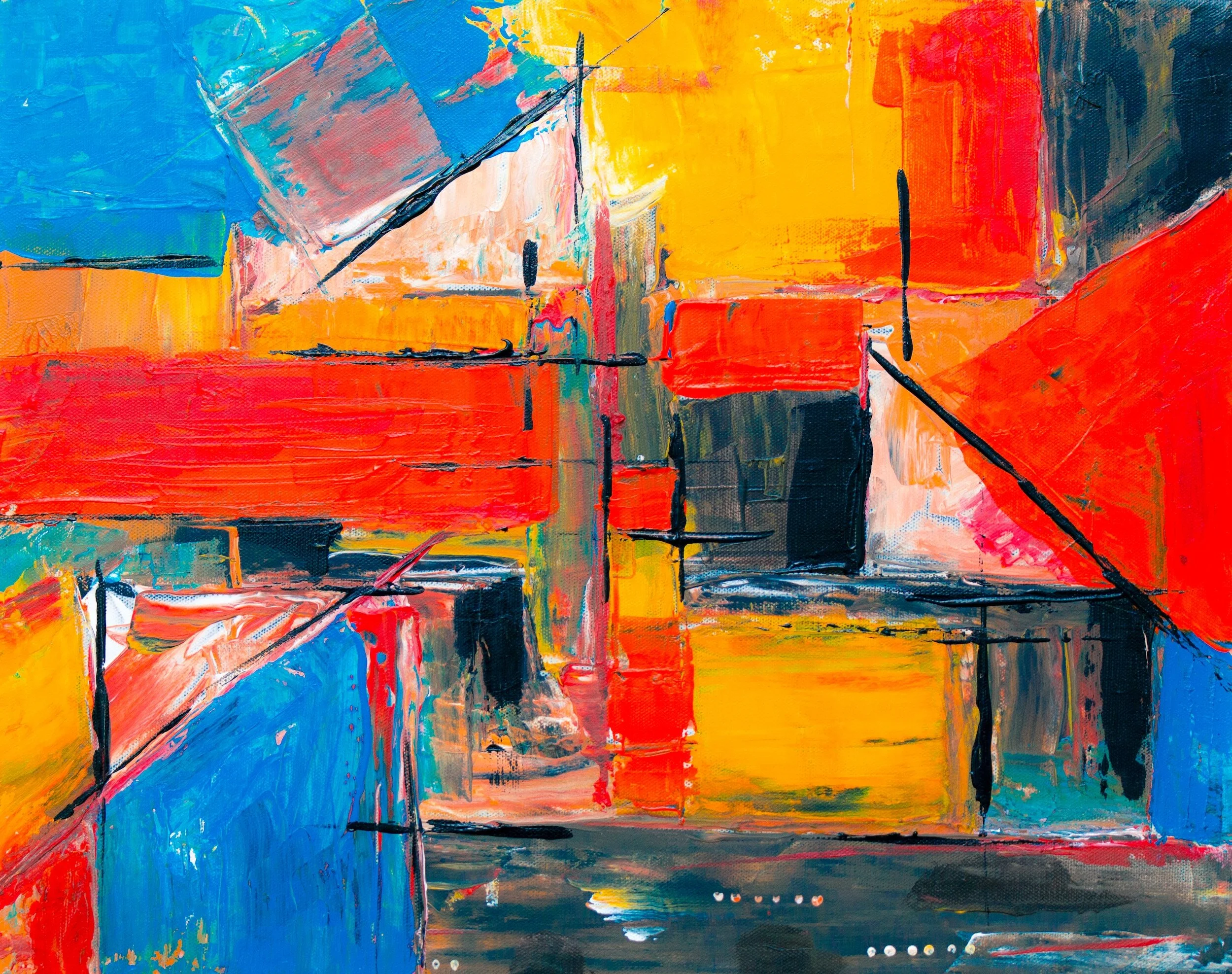
An example of the vivid color and bold texture achieved with oil paint.
Prints
Printing is a digital or physical transfer of an image that has been intentionally made to create multiple, exact copies. Prints in recent years are often digitally made, but some of these techniques have been in place for centuries:
Lithograph - Lithographs are created when an artist draws on stone using special lithographic materials. Oil-based inks are applied to the stone using a roller and stick only to the outlined image, and when the stone is put through a press, the image is transferred. Lithographs often contain multiple colors from multiple stones, acting as layers to create detailed images and new colors. Perhaps the best way to tell if a print is a hand lithography is to examine it under a magnifying glass. A hand lithograph will create a randomized pattern of dots, much like those you would see that create the vivid colors in newspaper printing.
Screenprint - Screenprints are created via stencils, through a layer of fine mesh, forming a screen for ink to push through. Once again, it may be easiest to identify by getting a look up close. In this technique, the ink sits on top of the paper often giving the finished image a puddled or velvety look which may be easier to identify in the area where two colors overlap.
Giclee - A giclee is one of the trickiest prints you will come across, made intentionally to look like an original oil painting. Giclees can be printed onto canvases digitally, but glossy varnishes and added texture is applied on top to mimic the look of oil paint. It is difficult to catch, but by looking up close at the canvas you can see the small dots that make up the print. Additionally, one clue that your piece may be a giclee is that the image area often wraps the image around the canvas with perfectly straight lines.
Woodcut- A woodcut print is created by an artist sketching out an image on - you guessed it- a wooden block, and carving out the relief. Ink is applied to the block and the image is transferred this way. Woodcut prints can be identified by a dark rim around the paper, and rougher lines in the image itself. Shading can only be done by making small marks in the wood, which isn’t the most precise in this format.
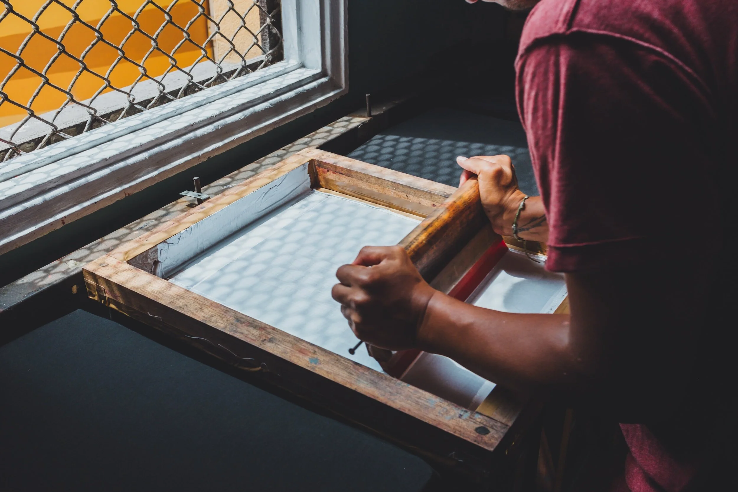
A photo of the screenprinting process.
What does an art appraiser look for?
If you are having a hard time placing your work in any of these categories, it might be time to reach out to an expert! The experimental nature of art leads to a variety of ever changing forms both now and in the past, and some may be harder to identify than others. Another way to identify what kind of work you have could be through subtle clues on the work itself.
Does the work have:
A gallery label? Gallery labels tend to be found on the back side of the work, in a sticker format or in an attached plastic sleeve. Gallery labels sometimes only identify the name of the gallery and its location, but oftentimes you can get lucky and the label will include a title, medium, date, or an inventory number detailing the work’s auction history. Having a gallery label at all can help researchers determine when the painting was made or sold despite having no other information.
An artist’s signature? Perhaps the single most important piece of evidence when looking at an artwork, the artist signature is key in determining what the work is, who created it, and what it could be worth. Paintings without an artist signature typically require excessive evidence and provenance research to authenticate, so be on the lookout for initials, a first name, last name, or even a date! Artists love to hide this information within the work itself, so it may take a few tries to spot the mark they left behind, blended in with the paint. Most artists leave a signature on the bottom right corner of the work, but this is not always the case.
Numbering? If you have a print with a number that looks like a fraction, it could be critical information regarding the limited quantity of prints made, making your work more or less rare. If a work boasts the number 12/15, it is #12 out of 15 total prints made, making it highly sought after and very limited. If the work suggests it is 376/500, it may not be as valuable.
Stamps, writing, or other notes? When all else fails, it is possible to find stamps, writing, and other notes on the back of canvases, either left by the artist, material manufacturer, gallery, museum, conservator, or anyone else who came into contact with the work! Stamps and labels from art suppliers who created the materials often name their businesses and even provide an address, making it that much easier to date the work and even locate where it was made. Handwritten inscriptions and notes have included poems, stories, addresses, etc, all of which add to the story of the work.